‘Advantageous Positions’: Paul’s ART STUFF ON A TRAIN 210

Allen Jones: ‘High Wire’, 2006
Sculpture parks are a most agreeable way to combine the countryside’s
freshening merits with the potential for positioning art
advantageously. My Easter visit to the New Art Centre at Roche Court,
illustrated that. Set, to the seasonal soundtrack of a rookery, in
sweeping hills near Salisbury, Roche Court has some excellent indoor
exhibition spaces – but its essence is the 85 or so sculptures in the
grounds. Among the most effective locations at present are Allen Jones’
acrobat ‘High Wire’, which spins in the wind as it hangs from a tree,
making the most of the changing distortions of a flexible figure as it
rotates. Paul Morrison also takes on trees with flatness: his botanical
illustration style ‘Hyazinthe’ is 13 feet high, enabling it to act
arboreally. Michael Craig-Martin’s wheelbarrow is another sculptural
drawing, and one which looks rather at home in the garden – though if
you prefer unnatural incursions, Craig-Martin also has a huge pink light
bulb nearby. David Annesley’s ‘Untitled (Circle)’ seems decidedly three
dimensional in that company, and works particularly well with a setting
of daffodils. Next up at Roche Court, to supplement the core of the
changing mix, is show of Anthony Caro – who taught the under-publicised
Annesley.
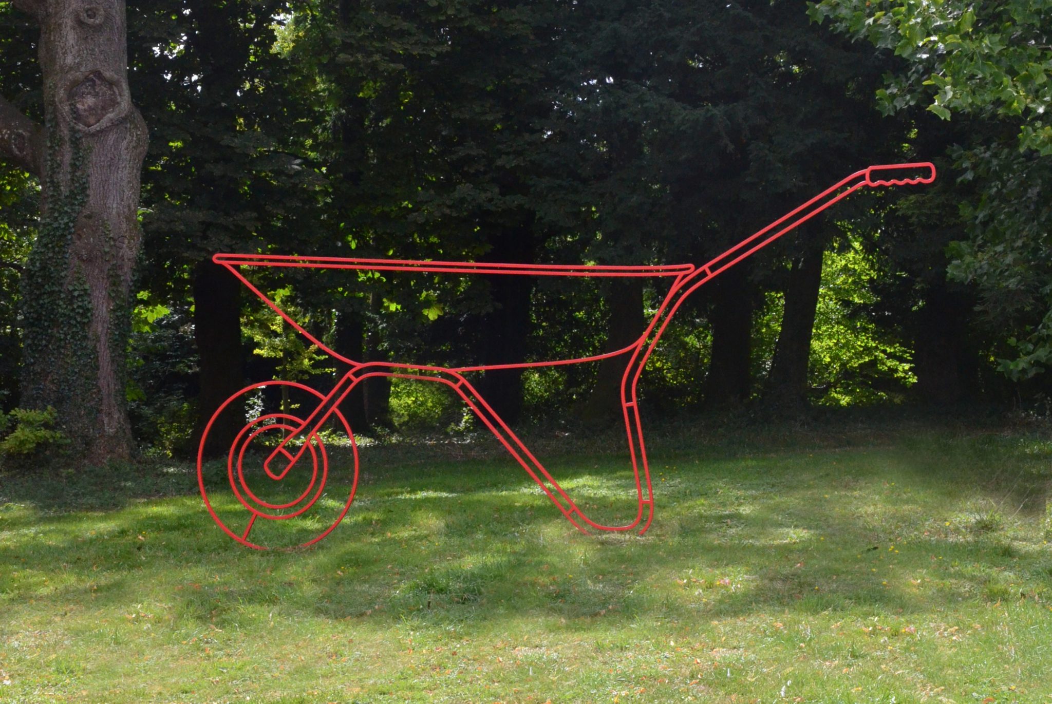
Michael Craig-Martin: ‘Wheelbarrow (red)’, 2013
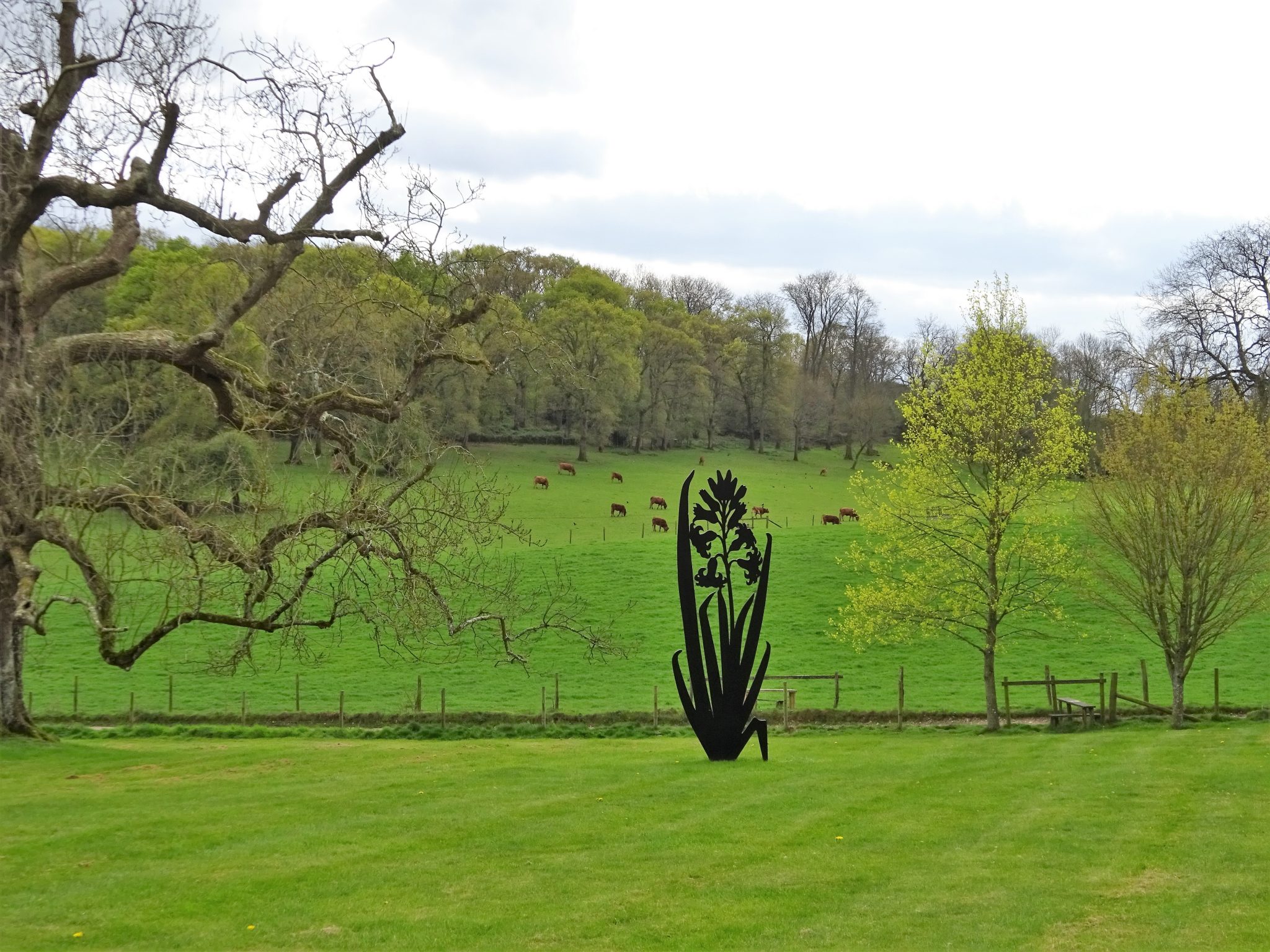
Paul Morrison: ‘Hyazinthe’, 2014

David Annesley: ‘Untitled (Circle)’, 1966
Most days art Critic Paul Carey-Kent spends hours on the train,
traveling between his home in Southampton and his day job in London.
Could he, we asked, jot down whatever came into his head?
'How to Go': Paul’s ART STUFF ON A TRAIN 209
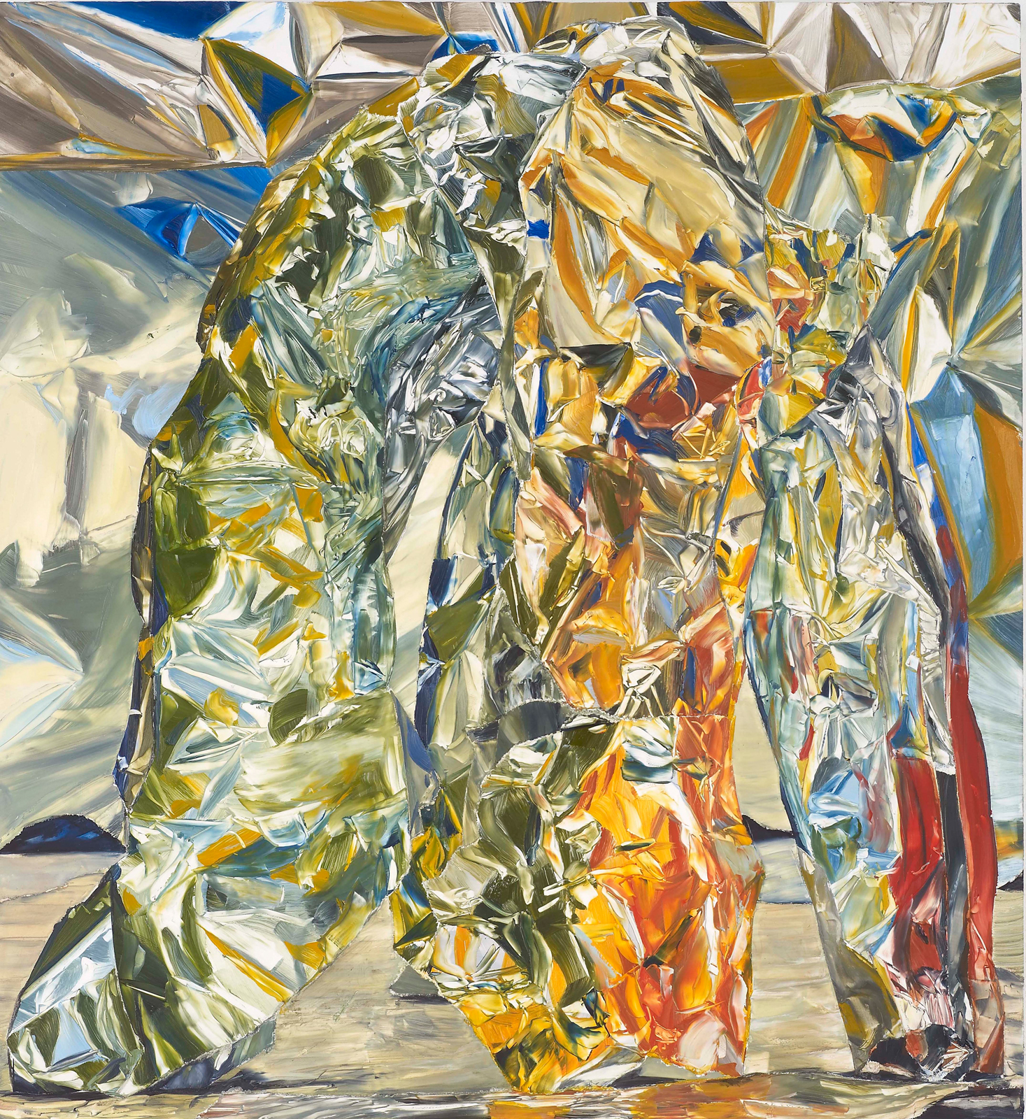
William Daniels: ‘Untitled’, 2013 – as shown at Vilma Gold
The well-respected Ibid, Limoncello and Vilma Gold galleries have closed their London spaces, in what may be a watershed moment for the art business. I suspect more mid-market primary galleries will follow. Minor aspect as it must seem to the gallerists, it is worth thinking about ‘how to close’. Max Wigram (2015) can stand for how not to: no communication – no email to the galleries’ lists, not even an indication on the websites, leaving the conclusion to be drawn over time as no new shows were scheduled. Limencello and Ibid did manage on site notice of their closures, and Vilma Gold did better still, sending a message to their email subscribers. Ibid is somewhat different, as it continues in LA, and also has an off-site show in London*, only not ibid (‘in the same place’). I suspect the general lack of communication is down to embarrassment at having ‘failed’. Yet really there’s no need: everyone appreciates that the business is a fickle one, and things change and move on. Better to celebrate what has been, and maybe even hold a farewell event. Ceri Hand was an example of how to close in upbeat mode, as was Poppy Sebire – in the same space, as it happens – before her. But they are exceptions. Rebecca May-Marston and Rachel Williams might also have celebrated, as they have exhibition records to be proud of, for all that the toxic combination of a difficult economy, soaring London rents, and the threats posed by Brexit and, perhaps, online alternatives, make it increasingly tough to make things work.
* One of their best artists, too: David Adamo at 15 Finsbury Circus, presented in conjunction with HS Projects. http://ibidgallery.com/wp-content/uploads/2016/01/Moorgate-PR-1.pdf
Most days art Critic Paul Carey-Kent spends hours on the train, traveling between his home in Southampton and his day job in London. Could he, we asked, jot down whatever came into his head?
‘Sex with Someone You Love’: Paul’s ART STUFF ON A TRAIN 208
Tom Worsfold: ‘DIY’, 2017, 160 x 240 cm – acrylic on canvas
Onanism isn’t the easiest art subject. ‘The Great Masturbator’, 1929, is some way from Dali’s best, even though the practice was close to his heart: it is said that he was an addict who, afflicted by various fears and hang-ups, practiced no other sexual activity. Nor does much of Sarah Lucas’ reputation ride on the ‘wanking arm’ stream of her work, or Sterling Ruby’s on his film ‘The Masturbators’. All the more credit, then, to Tom Worsfold for an appropriately seductive and humorous treatment of the theme in his recent show at Carlos / Ishikawa*. The diptych ‘DIY’ seems to show in the left hand panel the rather alarming use of a vacuum cleaner for purposes of self-relief, and in the comparatively empty right hand panel, deadpan instructions for turn-on and insertion. It all has the hit and miss air of the other sort of DIY, at least when I attempt it. Perhaps there’s a play, too, on the self-absorbed act of painting itself. Worsfold depicts a range of modern scenarios in parallel manner: waiting around, commuting, relaxing at an airport terminal: all sneak rather beautifully washy acrylic-as-watercolour patterned tactility into the environs of often partial glimpses of a Robert Crumb-ish type whom I take to be a self-portrait of sorts. Don’t overdo the suction, Tom, we’d like you to live to make more paintings!
Tom Worsfold: ‘Terminal’, 2017, 160 x 150 cm – acrylic on canvas
* www.carlosishikawa.com/exhibitions/apparition/
'Something for Nothing’: Paul’s ART STUFF ON A TRAIN #207
 |
| Samuel Zealey: 'Concord', 2017 |
An artwork for nothing? That’s a good trade, plain as the Concorde on your face. But wait… The star of Samuel Zealey’s new show is probably what he calls – being a fan of the American master - his ‘Serra in Reverse’. Where Serra uses the force of gravity pressing them together to keep precarious-looking giant steel plates from falling on us, Zealey sets the plates of ‘Life Line’ against each other so they push apart. No welding, just a stretched rope, prevents them falling down. It’s a little worrying, the more so when so much of the world seems about to collapse. The other big works at the Cob Gallery in Camden (‘Planes’ to 8 April) are the show-titling Folded Steel Plane Series’, several person-sized heavy metal versions of some of the 36 ways Zealey’s researches have tracked down for folding a paper plane. The fact that they’re also geometrical planes is emphasised by this move, and there’s a critical edge – typical of Zealey;s environmental focus - in the contrast in noxious emissions between model and reality. And the freebie? What was more natural than to ask Zealey to demonstrate his prowess by folding the show’s press release into a paper plane, and signing it as an edition. As if planned, the fold threw up planes on the wings, and it didn’t fly badly, either...
 |
| My Zealey edition contemplates a garden launch |
 |
| Installation view with 'Life Line', 2017 |
Most days art Critic Paul Carey-Kent spends hours on the train, traveling between his home in Southampton and his day job in London. Could he, we asked, jot down whatever came into his head?
'Secondary First’: Paul’s ART STUFF ON A TRAIN #206
Linder: Superautumatisme Grande Jete XV, 2015
There’s something natural in expecting new art in commercial spaces and older work in institutions. Yet many of Mayfair’s commercial galleries present secondarily sourced work, and there are several outstanding shows up now. Mazzoleni’s 30th anniversary exhibition of 30 modern Italian artists (to 5 May) scores with the high quality and often somewhat unusual choices and the strong case it makes for Salvo, Dorazio and Turcato – all little known here. My take-home would be an exemplary Burro. His language originated in dressing war wounds, which may be why I found myself seeing Giulio Turcato’s lunar scene painted onto rubber as ulcerous. Robilant + Voena reinforce my suspicion that if Tate wanted to show a South American surrealist they should have chosen Roberto Matta rather than the duller Wilfredo Lam (to April 20). Skarstedt’s survey of appropriative photography (‘Double Take’ to April 22) balances lots of now-classic Robert Heinecken and Richard Prince with more recent work in the same spirit. That links neatly to Luxembourg & Dayan’s ‘The Ends of Collage’, indeed that (to 13 May) also has Prince, with what could be described in boundary-pushing mode as ‘one image collages’. Add various others including plenty of John Stezaker, some unusual Linder and the too-rare chance to see Nusch Éluard as an artist, rather than as muse, and this – and the impressively organised book which accompanies it – is excellent. As is Pilar Ordovas’ display of just half a dozen white sculptures: Giacometti, Hepworth, Chillida…(‘Monochrome’ to 22 April). And, ending in Italy as we began, the highlights of M&L’s choices of Fontana in 3D are giant plates and a ceramic burst of fighting men from 1947.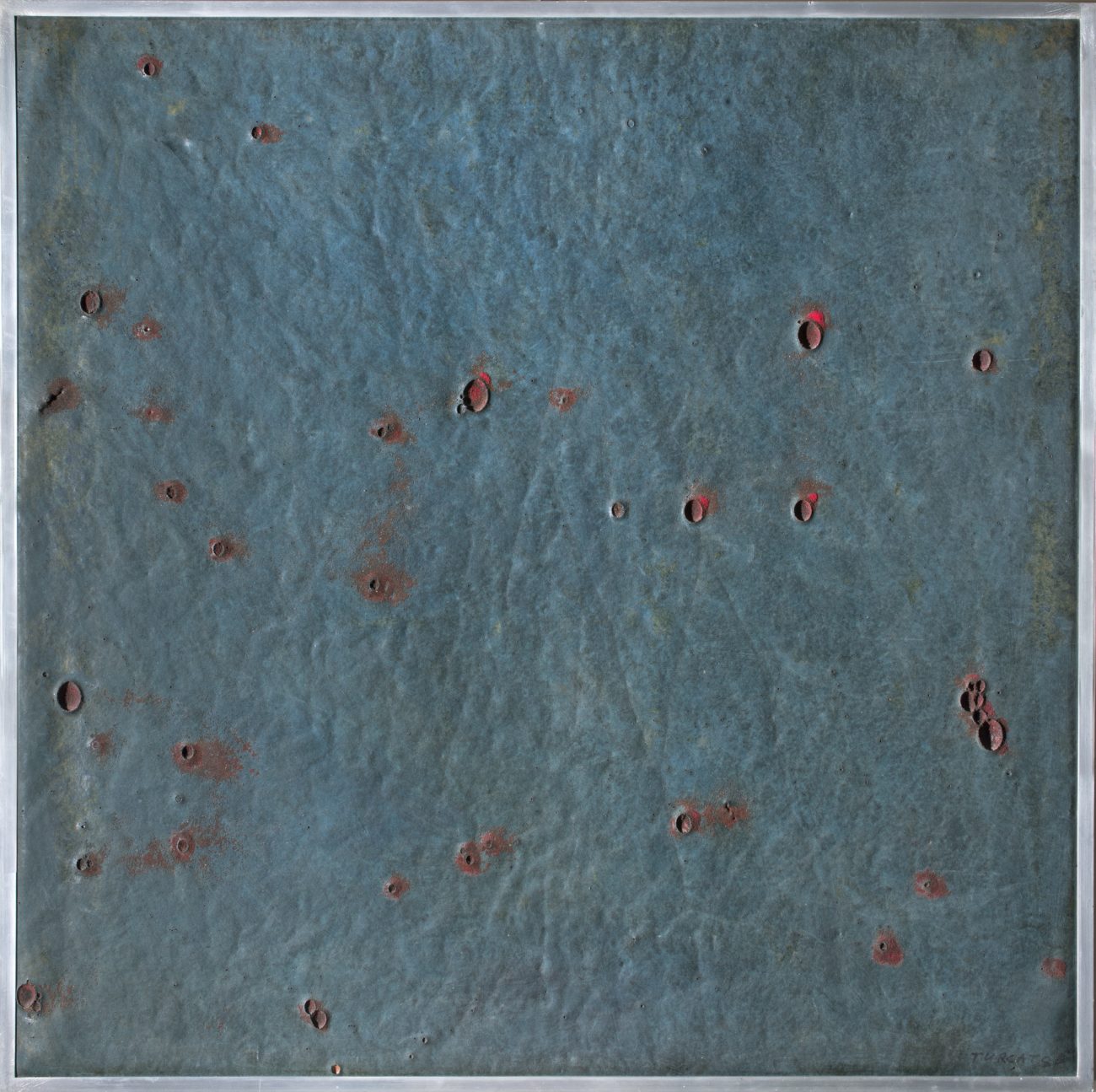 Guilio Turcato: Lunar Surface, 1964
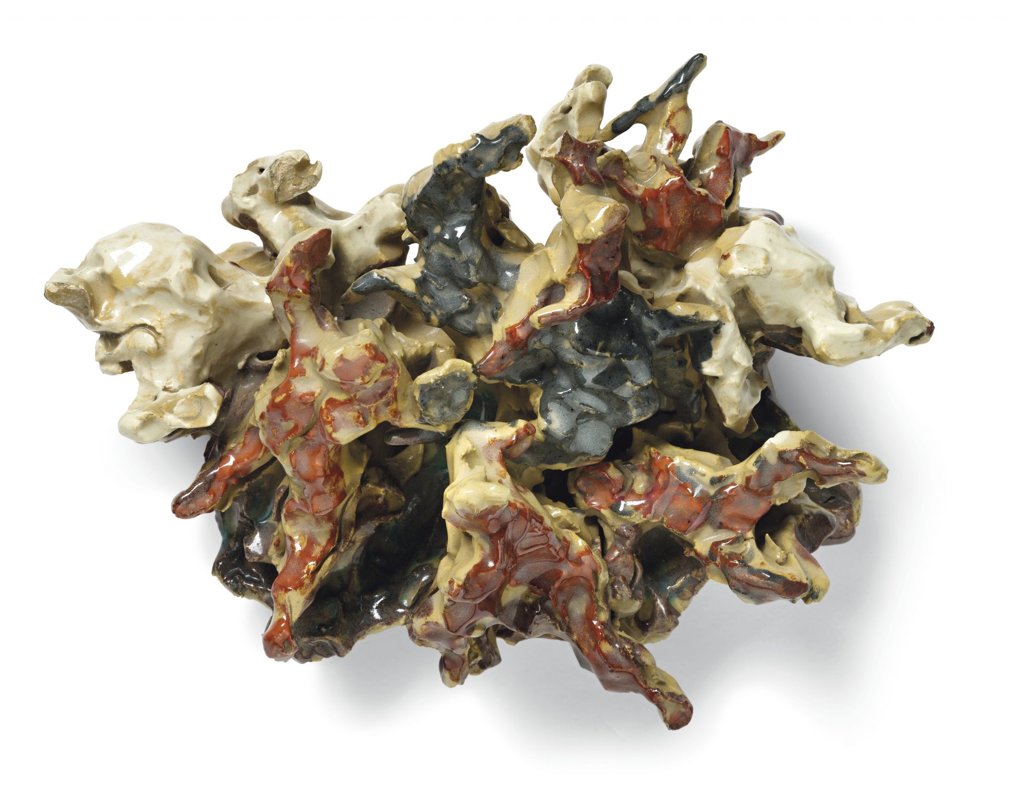 Lucio Fontana: ‘La Battaglia’, Polychrome glazed ceramic?, 1947
Most days art Critic Paul Carey-Kent spends hours on the train, traveling between his home in Southampton and his day job in London. Could he, we asked, jot down whatever came into his head?
Linder: Superautumatisme Grande Jete XV, 2015
There’s something natural in expecting new art in commercial spaces and older work in institutions. Yet many of Mayfair’s commercial galleries present secondarily sourced work, and there are several outstanding shows up now. Mazzoleni’s 30th anniversary exhibition of 30 modern Italian artists (to 5 May) scores with the high quality and often somewhat unusual choices and the strong case it makes for Salvo, Dorazio and Turcato – all little known here. My take-home would be an exemplary Burro. His language originated in dressing war wounds, which may be why I found myself seeing Giulio Turcato’s lunar scene painted onto rubber as ulcerous. Robilant + Voena reinforce my suspicion that if Tate wanted to show a South American surrealist they should have chosen Roberto Matta rather than the duller Wilfredo Lam (to April 20). Skarstedt’s survey of appropriative photography (‘Double Take’ to April 22) balances lots of now-classic Robert Heinecken and Richard Prince with more recent work in the same spirit. That links neatly to Luxembourg & Dayan’s ‘The Ends of Collage’, indeed that (to 13 May) also has Prince, with what could be described in boundary-pushing mode as ‘one image collages’. Add various others including plenty of John Stezaker, some unusual Linder and the too-rare chance to see Nusch Éluard as an artist, rather than as muse, and this – and the impressively organised book which accompanies it – is excellent. As is Pilar Ordovas’ display of just half a dozen white sculptures: Giacometti, Hepworth, Chillida…(‘Monochrome’ to 22 April). And, ending in Italy as we began, the highlights of M&L’s choices of Fontana in 3D are giant plates and a ceramic burst of fighting men from 1947.
Guilio Turcato: Lunar Surface, 1964Lucio Fontana: ‘La Battaglia’, Polychrome glazed ceramic?, 1947Most days art Critic Paul Carey-Kent spends hours on the train, traveling between his home in Southampton and his day job in London. Could he, we asked, jot down whatever came into his head?
‘Drawn to Room’ Paul’s ART STUFF ON A TRAIN #206
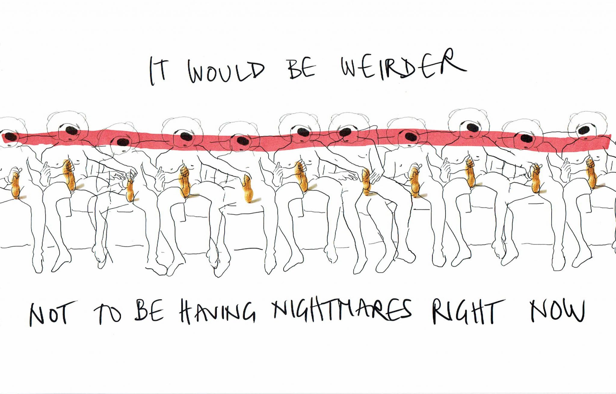 |
| Heather Phillipson: ‘It would be weirder not to be having nightmares right now’, 2017 – digital drawing with ink and marker pen |
250 works in A4 size! Purchasable in an online auction starting at £250! Drawing Biennial 2017 is Drawing Room’s best yet. The work-by-work standard is high, and if it’s hard to grasp as a whole, there are plenty of categories you might apply. There are, for example, six Turner Prize winners here (Deacon, Gormley, Kapoor, Perry, Prouvost, Wallinger) and some impressive international names you might not have expected (Jean-Luc Molène, William Kentridge, Anthony McCall…) There is some evidence of the equation ‘greatest fame, least effort’ – certainly Marcus Cope’s cunningly motif-linked inside-outside slab of lovingly detailed domesticity fits the other half of that tendency. I was, of course, more diverted by the contributions of artists who’ve been in my own shows (Alice Anderson, Rana Begum, Oona Grimes, Danny Rolph, John Smith, Troika, Julie Verhoeven). More thematically, some memorable text work phrases come up, from ‘Not All Friends Are Friends’ (Eddie Peake) to ‘Death of the Internet’ (Suzanne Triester) to the Trump-tinged worries of Heather Phillipson. ‘It would be weirder not to be having nightmares right now’ sets the weird bar pretty high, and may refer through its circle jerk of peanuts to the President including the size of his penis in his campaign content… Plenty more classifications – from category mistakes to footwear to thaumaturgy (‘a fancy name for magic’) – are provided by Tom Morton’s sparkling catalogue notes.. And Tannery Arts, which adjoins Drawing Room, has a show on ‘Shaping the Void’ which is also well worth seeing…

Marcus Cope: ‘Building Blocks’, 2017 – watercolour on paper
Most days art Critic Paul Carey-Kent spends hours on the train, traveling between his home in Southampton and his day job in London. Could he, we asked, jot down whatever came into his head?
‘Not his Best Period?’ Paul’s ART STUFF ON A TRAIN #205
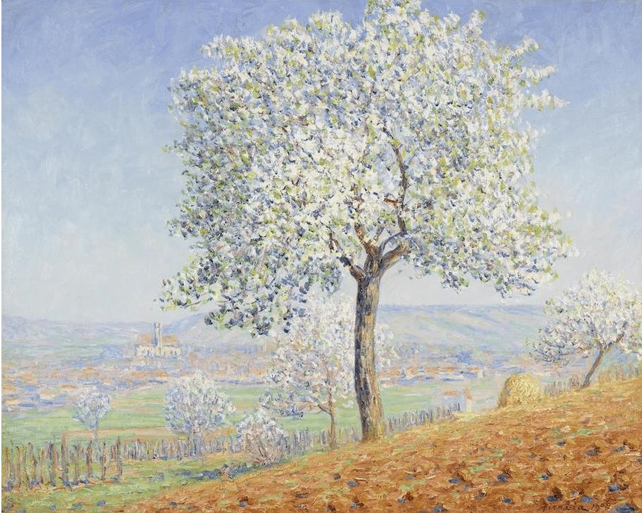
Francis Picabia: ‘Trees in Flower at Villeneuve-sur-Yonne’, 1906 oil on canvas 74 x 92cm
Looking around auctions recently, two works at Bonhams emphasised how prices vary across artists’ careers. In the long term, this often this rights itself – either it is all embraced by the market as with Picasso or Warhol, or the whole oeuvre falls out of favour. 50 years ago Francis Picabia (1878-1953) was pretty much defined by his Dada output of the 1920s. The many eclectic phases of his subsequent work are now highly valued, but his pre-Dada Impressionism (or pastiche Impressionism?) Is still relatively cheap. He painted 300 such canvasses during 1903 – 09, studio productions from secondary sources, so – as would become typical – undermining the character of a genre even as he embraced it. All the same, ‘Les arbres en fleurs à Villeneuve-sur-Yonne’ conveys the air of spring rather attractively. This typical example was estimated at £130-180,000* but went for £605,000 at Bonham’s, suggesting that a correction is occurring (a comparable Pissarro was £1.2-£1.8m at Christies). In contrast, while early de Chirico is very much top end, he dismissed modernism in 1919 and his later work was dismissed in turn for many years, although somewhat more attention is now paid to it. One proclivity of de Chirico (1888-1978) was to make backdated copies of his classic works, a ‘self-fakery’ sometimes seen as a pre-post-modernist move. These early 60’s horses, though, are from his tributes to the masters of the Baroque which, in Picabian mode, are interesting precisely insofar as they fail to ring quite true. Estimated at £50-70,000*, this sold for £65,000, so no shift there.
* compares with the £5m which might be expected for a top period work
** compares with the £2m which might be expected for a top period work

Giorgio de Chirico: ‘Frightened Horses’, 1960-65 – oil on canvas 52 x 63cm
Most days art Critic Paul Carey-Kent spends hours on the train, traveling between his home in Southampton and his day job in London. Could he, we asked, jot down whatever came into his head?
‘Art and Drink’: Paul’s ART STUFF ON A TRAIN #204

Jemima Brown: ‘Untitled Wife’, 2016
London is an increasingly problematic location for galleries, given rent levels. Perhaps there will be more shows in cafés, pubs, restaurants and such. At any rate, I was able to catch three such last Thursday. Charlie Smith, above The Reliance in Hoxton, has two shows to on ‘street semiotics’ to 25 March: in the main gallery (chosen by gallerist Xavier Ellis) and in he back room (selected by David Hancock of Manchester gallery Paper) – which is where you’ll discover Jemima Brown’s ‘Untitled Wife’, which makes great use of a pan scourer as a trendy top and pampas grass as big hair. The Approach gallery sits, rather naturally, above The Approach Tavern. Currently it’s as liquid above as below, at least in terms of art: German painter Helene Appel, who paints post-modernist Trompe-l’œil, often with lots of near-paradoxical raw canvas on show, has enormous tidescapes – waves expiring on beaches as if the paint just washed over them; middle format sinks; and tiny depictions of pasta (to 26 March). All life sized, I suppose. The gallery space was literally dry though: The Approach makes the most of its location by not serving drinks at openings. A newer, less established space is The Workers’ Café at 404 Kingsland Road. There you’ll find an attractive selection of works on paper by 25 contributors chosen by artist Carolina Ambida, and presented along with a nice little catalogue, which is something neither pub can boast (‘The Drawing Show’ to 10 March).
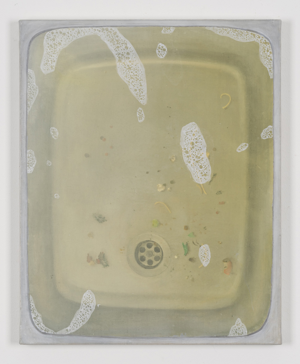
Helene Appel: ‘Sink 2’, 2016
Works by Alex Michon, Cathy Lomax and Tom Mason in
‘The Drawing Show’
Most days art Critic Paul Carey-Kent spends hours on the train, traveling between his home in Southampton and his day job in London. Could he, we asked, jot down whatever came into his head?
‘Use It Up’: Paul’s ART STUFF ON A TRAIN #203
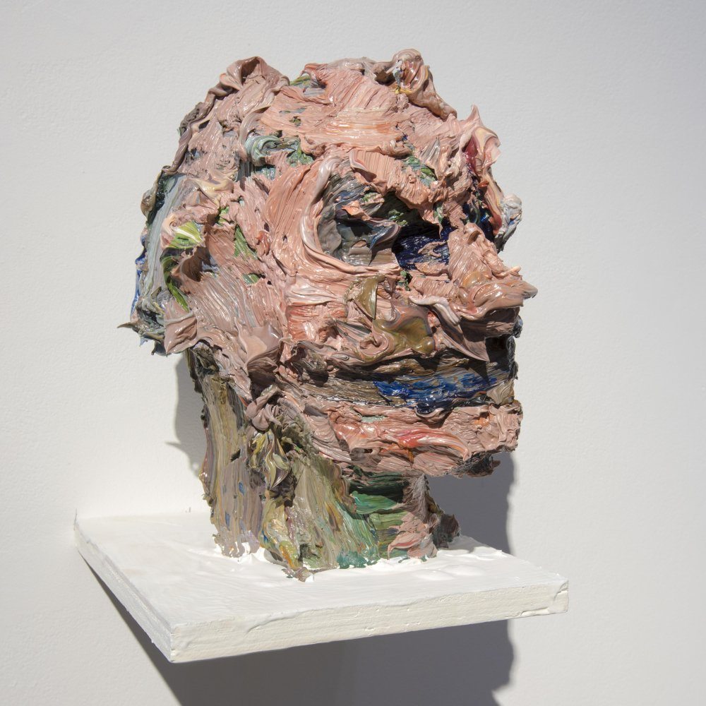
Tai-Shan Schierenberg: ‘Loki’, 2014 Oil paint and polestyrene, 28 x 26 cm
Paint is expensive stuff, best make the most of it. For the first time Tai-Shan Schierenberg is showing his sculptures (Flowers Gallery to 25 March). They’re heads made of paint on polystyrene, rather in the manner of Glenn Brown’s neat reversals of his flat Auerbach-style paintings, but unlike Brown (so far as I know) Schierenberg uses the paint scraped daily from his palette, making them something of a diary of his practice. That’s a known way of generating a chance-heavy yet grounded colour result. Gerhard Richter is the famous practitioner: most days he scrapes his palette off across a photograph, thus imposing a personalised diaristic mark which echoes his two famous moves: of blurring an image, or of employing stick-scraped paint as the basis for abstraction. Jonathan Meese, somewhat mockingly I suspect, has imposed similar markings onto images of his rather more chaotic life. At a slight angle to those, some of Bernard Frize’s earliest abstract works were made peeled off the coloured skins from pots of paint left open in the studio, and applying them over the surface of the canvas. And Jonathan Horowitz made his Leftover Paint Abstractions (2014) by flinging whatever half-used cans of paint were in his studio against a canvas. “I see them as a repository’, he says, ‘for something that would have gone in a landfill’. Not just economical, but responsible…
Gerhard Richter: ‘ Fextal, Piz Chapütschin 1992’ 10 cm x 15 cm Oil on colour photograph
Jonathan Horowitz
‘Reasons to Sallivate – or Not’: Paul’s ART STUFF ON A TRAIN #202

David Salle: ‘Mingus in Mexico’, 1990
American painter David Salle (say ‘Sally’) has been prominent recently: following Skarstedt’s memorable showing of his ‘tapestry paintings’ late last year, and there’s more of his richly multi-sourced 1990’s work in the Saatchi Gallery’s uneven survey of ten ‘painter’s painters’ (does that make Charles a secret painter? Either way, to 28 Feb). And Salle has just published ‘How to See’, a collection of his writings on art, more in the territory of accumulating observations than of setting out grand theories, though he has emphasised that he’s ‘against literal-mindedness’, believing that in art ‘the how of its making is just as important as what it represents’. Salle is an erudite and entertaining companion, refreshingly open about reviewing his friends, and has plenty of interesting things to say about what makes good art, especially painting *. So, what to muse on when looking at Salle’s own conflations of art forms and time zones? ‘How?’, as well as ‘what?’ and ‘why?’, must be a good question by his anti-literalist lights. And three tests he cites and ought to pass are: ‘take a work’s temperature, look at its surface energy’, ‘gestures should be harnessed to the painting’s internal architecture, not just surface decoration’ and ‘the aesthetic rationale for using appropriation… is to insert a tiny wedge between the name and the named, to search out a crack in the wall built of habit and certainty, and work into that small fissure a measure of existential rebellion’.

David Salle: ‘Old Bottles’, 1995
* That said, quibbles are possible. The book kicks off with a discussion of Alex Katz’s use of colour (‘what counts most is the intervals between colours, precisely chosen’) illustrated by a pretty poor black-and-white reproduction – indeed, the only colour illustration is of the author! It’s probably in the nature of such a production, unless proactively edited, that some repetition occurs, and Salle lets plenty stand. And there’s no attempt at balance: perhaps naturally – as they’re often his friends – Salle concentrates on old white men who paint, mostly American-based, with just a couple of non-painters, a couple of women, and a couple of non-Caucasians (Oscar Murillo cops it for making ‘painting for people who don’t have much interest in looking, who prefer the back story to what’s in front of their eyes’).
Most days art Critic Paul Carey-Kent spends hours on the train, traveling between his home in Southampton and his day job in London. Could he, we asked, jot down whatever came into his head?
‘Still on Fire’: Paul’s ART STUFF ON A TRAIN #201

Clyfford Still: PH-150, 1958
I’ve just seen the Royal Academy’s show Abstract Expressionism on its transfer to Bilbao. The highlight remains the craggy abstractions of mid westerner Clyfford Still (1904-80). Still has had little prior visibility in Europe, mainly due to a famously difficult character, but he’s worth the hassle. Even at 21, he enrolled at the Art Students League in New York, but left within an hour, concluding that he had already rejected most of what was being taught. He spent only the 1950’s in New York, long enough to fall out with his gallerist and all the other abstract expressionists except Pollock. He rarely allowed his work to be shown, didn’t want it written about (all critics being ‘imbecilic’) and wasn’t too interested in selling. Instead, he gave 60 paintings to museums in San Francisco and Buffalo, then left his estate Turner-style to any city prepared to dedicate a museum to it: the Clyfford Still Museum opened in Denver in 2011 with 825 paintings, 1,575 works on paper, and no café or bookshop allowed. Still was the first of the group to go big, most typically 9 x 13 feet. The verticality of figures and the grandeur of frontier landscapes are equally evoked by his abstract sublimity, in which he uses a pallet knife to achieve contrasts of matt and gloss. There’s a quality of Gothic ascension which has been seen as symbolising a dialogue between Earth and Heaven, but it might equally be self and nature. ‘You can turn the lights out’, he told one venue, ‘the paintings carry their own fire’.
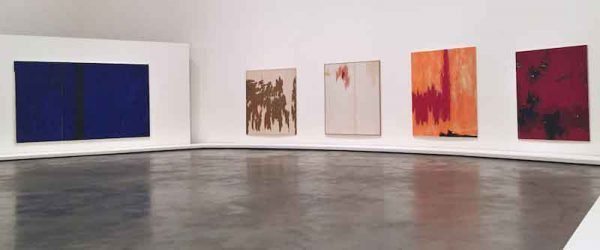
Installation shot, Bilbao
Most days art Critic Paul Carey-Kent spends hours on the train, traveling between his home in Southampton and his day job in London. Could he, we asked, jot down whatever came into his head?

No comments:
Post a Comment
Note: only a member of this blog may post a comment.